
Things to Consider When Creating Pop Up for Your Website
Website pop-ups are very sensitive features since if you use them wrongly, your web visitors will find them irritating. However, these pop-ups can be good marketing tools to boost your e-commerce sales if used correctly.
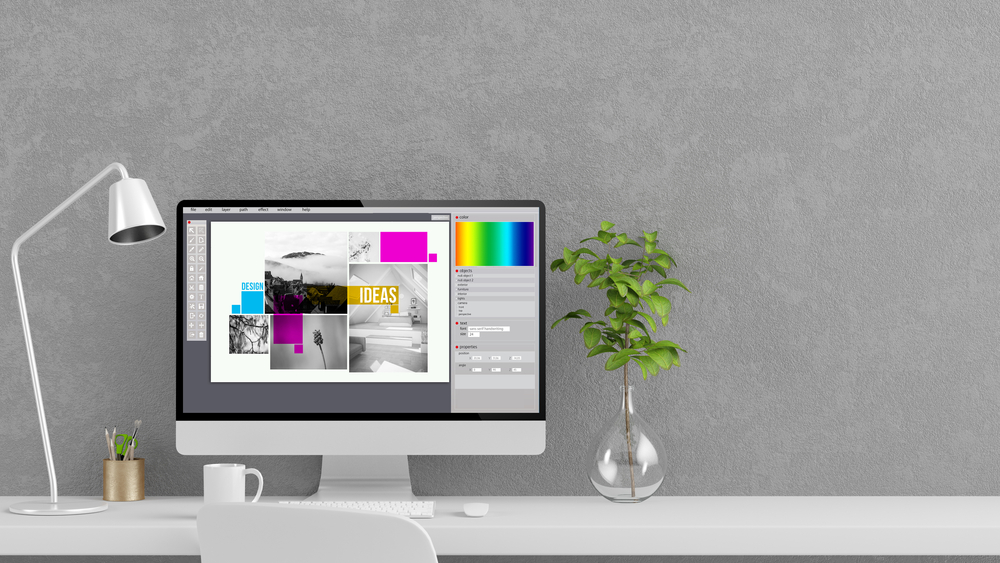
A website pop up is a display box that appears on top of the page's content. This display box contains additional information about a particular product or service. The ideal website pop up complements the images and immersive videos on your site. Visit Cinema8 to learn how to edit your videos and make them interactive using the 360-degree special features.
There are various elements to consider when creating the perfect website pop up and they include;
1. Your Website's Design
It is essential that the pop up you wish to use matches your website and complements it. However, the ideal website pop-up distinguishes itself from the site's content to effectively capture visitors' attention.
These display boxes come in different shapes and designs. Therefore, a good website designer knows how to select the best design that matches the site. Choosing the right pop up design makes your site look organized.
Also, visitors tend to stay longer on your site since the display box keeps them engaged. The best way to find your perfect pop up design is to experiment with different shapes and customize them to make them unique and eye-catching.
The good thing about website pop-ups is that they are easy to create and manipulate, especially the square display boxes. This gives you the freedom to become creative and try different shapes. For instance, you can create shapes and introduce them as floating images to the display box.
2. Your Website's Color Theme
A good website pop up complements the website's colour theme. Using the correct color blocks on these display boxes makes the content noticeable, increasing readability.
It is best to learn the different colours, their properties, and how well they can blend. All this aims to use pop-up colours that capture the viewer's attention, pass the message, and complement the background colours and images.
One of the common features most web designers use is the see-through blocks. These features can be very effective if they blend well with the website's background. The perfect colour to use on your colour block does not contrast with the background image.
Photoshop is reliable editing software that allows you to manipulate and customize your colour blocks, such as adjusting the opacity. Ensure that the colour blocks you choose complement the immersive videos from Cinema8.
3. Different User Devices
Google introduced the interstitials policy a few years ago that scared most marketers. The policy states that website owners can get punished if their intrusive pop-ups get misused on mobile devices. Therefore, there is a need to understand how to design mobile pop-ups through best practices.
Since there is less room available on the mobile screen, the guiding principle here is to keep the elements featured in the pop-ups at a minimum. Most web designers prefer using Sleeknote to create a desktop pop up then switching it to a mobile view to remove the unnecessary elements. This trick saves you time and ensures you have the pop-up design for desktop and mobile devices.
Also, there are a few things to consider as you make this switch that are;
• It is important to unlink the elements you want to change or remove in the mobile pop up. Doing this prevents these changes from affecting the original desktop version.
• Consider removing the background image featured on the desktop pop-up, as it may look confusing when incorporated in the limited mobile design space.
• Avoid using more than two input fields in the mobile pop up since too much content makes the user scroll for long, which might cause some irritations or frustrations.
The benefit of using this technique is that your pop-ups match in design and contain the same information, but one is customized to meet the mobile requirements.
4. The Right Fonts to Use
We can't discuss customizing the perfect pop up design without mentioning how to choose the right font. Of course, it is better to use the most used font on the website as you design these display boxes, for starters. However, experienced web designers prefer getting creative with the fonts to capture the visitor's attention and pass the message effectively.
Some tips to consider when choosing the right fonts to use are:
• Choose creative but clear fonts for the headlines to help you capture the viewer's attention.
• Use your standard website font to ensure uniformity, and the message doesn't lose its meaning for the copy.
• It is not advisable to use more than two fonts for these pop-ups.
The trick towards finding the perfect choice is to experiment with different fonts. Then, use your website's font to judge whether the chosen option is easy to read and understand.
5. Spacing
Also, as you pick the right fonts to use, it is important to consider the spacing. If the spacing in your display box is off, the pop-up looks bad, negatively affecting your conversion rate. Therefore, there is a need to find the right spacing for your fonts.
The trick towards getting the spacing right is to be consistent. This means that, if possible, try using the same spacing throughout. Spacing the elements equally makes your pop up look organized and appealing, increasing the conversion rate.
Apart from that, you can also rely on your visuals to determine if the spacing is off. For instance, you can be consistent with your spaces, but having a single word on one line is not reasonable.
There is no perfect spacing tip that works on all website pop-ups. Therefore, you have to use the provided tips to ensure your work looks professional if you wish to increase your conversion rate.
6. The Call to Action Button
The main feature of any website pop up is the call to action button that allows users to subscribe to a mailing list or check out other interesting products and services. Therefore, it has to be the centre of attraction if you wish to generate more clicks.
As a web designer, it is your job to ensure that your CTA button encourages viewers to click through. There are various ways to make your CTA stand out, such as using contrasting colours; for example, you can use a black CTA button against a white background.
One of the best strategies to use as you feature the CTA is to use two buttons to allow the viewers to choose. This is a better approach since it allows the visitor to decide whether to view the redirected page or not. However, just because the viewer chooses not to proceed to the redirected page doesn't mean it's impossible to turn them to customers.
One mistake most website developers make is using negative language in their second CTA button. This hurts your conversion rate since most people find them annoying. Therefore, refrain from using negative language and allow the visitor to browse through your website freely.
It is also important to use fewer input fields in your pop up. If there's a chance that you can remove an input field and still get the desired information, then that means it is an unnecessary feature.
Statistics show that you decrease your site's conversion rate by about 50% with every input field you include in your pop-ups. This shows how damaging these fields can be if not kept at a minimum.
These numbers are because web users are less willing to enter their personal information in these fields because of security and other personal reasons. Therefore, using fewer input fields improves your marketing campaign by increasing your site's conversion rate.
7. Your Audience
As you design your pop up, it is important to determine your target audience and how the message on the display box relates to them. For example, are the visitors casually browsing through your video content, or are they prospective clients? Asking yourself these questions allows you to evaluate the importance of the pop-up and if it is necessary.

The guiding principle to follow is the pop-up should display a message or offer that corresponds to the viewer's position on the site. This means that if they're having a quick review of your site, a mailing display box is relevant. However, a coupon code pop up makes more sense for prospective clients proceeding to the check-out page.
Doing this allows your site to stay relevant to the cause. In addition, it also acts as a guide to help customers through the different pages, for example; when checking out.
Also, remember to give an offer that is good enough to the audience. Studies show that customers relate well to free demo and coupon code pop-ups. These options tend to be appealing and have a higher conversion rate.
8. The Message
Most people view pop-ups as interruptions, and that's why they are quick to reject or close them. The main reason for having this feature is to persuade customers to click on the CTA and convert them to prospective clients. However, these display boxes have a small window to do this, and therefore it is important to ensure the message is clear and to the point.
There is a recommended basic structure to display your message on these pop-ups.
• Begin with a precise headline that highlights the subject or offer.
• Next is to write a supporting copy that gives insight into the available offer.
• The third feature is the CTA button that redirects the viewers to the relevant page or section.
• Lastly, a close button must allow the uninterested viewers to get back to the site.
This is just but a basic structure, and there are instances where you'll have to include more sections such as images to drive the message better.
Most web designers don't understand the importance of the close button. As a result, you'll find sites where this button is greyed out or hidden in the background. This doesn't seem right because if the viewer finds it difficult to exit the pop-up, there are higher chances that they'll get frustrated and leave your website.
9. The Goal
After using the tips above to create the ideal website pop up, it's time to determine if it satisfies your goals and aim. The best way to do this is by conducting a series of tests and making some adjustments.
There are various tests available such as the A/B test, to help you gauge the relevance of your display box. With the A/B test, you use two different design versions and sample several potential users to help you determine which works best.
Feedback from second and third parties is important as it gives you feedback from a different perspective. Also, these users might spot some errors you might have overlooked during creation. Remember, it doesn't matter how great you think your pop up is; what's important is what the visitors think after viewing it.
Optimize Your Website Videos at Cinema8
Pop-ups additional features that will help you increase your website's conversion rates. If you also wish to boost your marketing sales and campaigns on your website, use the various video editing tools at Cinema8 to make your content more immersive and engaging.
There are different video templates to try out and a demo available to guide you through. In addition to the awesome editing tools, check out the rich showcase that includes marketing support, 360-degree video gamification, e-commerce, entertainment, eLearning, travel and widgets.
Conclusion
Pop-ups are sensitive website features that can boost or decrease your site's conversion rate. Therefore, it is essential to understand how to create the ideal one that your visitors find easy to interact with. These features have helped successful brands interact with new clients and close major deals.
Here is a guide highlighting the important factors to consider as you design the effective display box. These strategies work and use them to boost your marketing reach, engagements, and sales.