What is mobile-friendly interactive video design?
Mobile-friendly interactive video design ensures that videos remain fully functional and visually consistent across mobile devices such as smartphones and tablets. It involves adapting interactive elements, such as buttons, overlays, or forms, for smaller screens and touch interfaces. When designed correctly, mobile-friendly interactive videos improve accessibility, engagement, and viewer satisfaction on any device.
Definition of mobile-friendly interactive video design
Mobile-friendly interactive video design enables seamless viewer engagement across devices and is a key consideration when utilising a video hosting or interactive video platform. Core features include:
- Responsive layouts: Automatically adjust video and interface elements for different screen sizes.
- Touch-optimised interactions: Design overlays and buttons for finger-based navigation.
- Adaptive video quality: Adjust playback resolution based on device and bandwidth.
- Simplified menus: Streamline choices and navigation for smaller displays.
- Consistent UX design: Maintain usability across desktop and mobile environments.
Why does mobile-friendly interactive video design matter?
Mobile viewing now dominates online video consumption. If interactive content isn’t optimised for smaller screens, essential features can become difficult to use or completely inaccessible. Ensuring mobile compatibility preserves viewer experience, keeps engagement data accurate, and maintains conversion opportunities.
Strong design principles extend beyond layout. They include analytics tracking, playback speed, and responsive overlays. Insights from mobile viewers often reveal what content truly holds attention. When using practical examples of interactive video, you can later refine your content even further to truly maximise engagement on mobile devices.
What are the benefits of mobile-friendly interactive video design?
The main benefits of mobile-friendly interactive video design include improved accessibility, higher completion rates, and a consistent brand experience across devices. Viewers expect videos to perform equally well whether they’re watching on a phone, tablet, or desktop. Responsive design ensures no functionality or visual quality is lost.
From a performance perspective, mobile-friendly design also reduces bounce rates and boosts conversions, particularly for marketing and e-learning content. Reliable hosting infrastructure ensures fast load times and uninterrupted playback, making every interaction feel smooth and immediate.
Applications of mobile-friendly interactive video design
Mobile-friendly design applies across all industries using video for communication, training, or marketing.
Brands use it to deliver mobile-optimised product demos or campaigns. Educators rely on it for flexible, on-the-go learning. Agencies integrate it into cross-platform strategies that reach audiences wherever they are.
Cinema8’s solutions, such as interactive video for marketing agencies, support this flexibility by allowing creators to build interactive experiences that adapt effortlessly to every screen size.
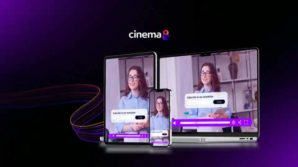
How Cinema8 uses mobile-friendly interactive video design
Cinema8 ensures all interactive videos are fully responsive across mobile and desktop environments. Its drag-and-drop editor automatically scales buttons, overlays, and navigation elements, maintaining usability and design quality on any device.
Through integrated analytics and responsive playback technology, creators can monitor how users interact across different screen types. Whether for learning, product demos, or marketing campaigns, Cinema8 enables truly mobile-first interactive video experiences that maximise engagement everywhere.
Book a demo to explore how Cinema8’s mobile-friendly interactive video tools help you design content that looks great and performs flawlessly on every device.