
A visual representation is critical in today's business environment since it facilitates the identification of potential growth areas and helps maximize revenue. It's challenging to turn large amounts of data into actionable insights, but there's no limit to the possibilities. Visualization is the tool you need.

In our writings, we frequently discuss visualization, particularly its usefulness in helping to manage projects, solve problems, develop strategy, and learn. Whether you are an executive looking for multiple perspectives on a given situation, a programmer, or a strategist, nothing can alter your ideas more than a pen and paper (or a computer screen) to fine-tune them and make them better. If you want to ensure that others understand your ideas, you should visualize them in order to ensure you are communicating your ideas effectively.
Engage the creative part of you and try an innovative visual format when it's time to present your concept to colleagues or clients.
25 Creative Ways to Visualize Your Ideas
You can make your concepts more effective by visualizing your ideas. Don’t know how to visualize your ideas? These diagrams will help you quickly present your complex ideas.
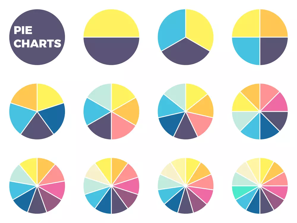
1. Pie Chart
Pie charts serve as data presentation by dividing a circle into segments that represent values. Pie charts divide values into sections (or the slices) based on their size.
Steps to Draw a Pie Chart
- Create a circle having any radius.
- Draw a line along the horizontal axis
- Using the horizontal radius as a starting point, draw the radii, and coincide the central angles with their respective components.
- Repeat the procedure for each element of the data provided.
- Each of these radii consists of different sectors of the circle.
- Apply different shades of color to the other sectors to convey their various components.
2. Doughnut Chart
In contrast to pie charts, doughnut charts are an improved version that eliminates the problem of understanding pie charts. Such charts are famous for their ability to show the 'part-to-whole' relationship - every part represents 100% when they are all added together.
Comparatively, they present information concisely and straightforwardly. In addition, the central hole facilitates the display of related information.
Learn how to draw donoghout charts from here.
3. Exploded Pie Chart
You separate a pie from the chart in an exploded pie chart rather than join them. The purpose of this is usually to draw attention to a particular sector or slice of the pie chart. Using this chart, each value is displayed individually, but their contribution to a total is highly emphasized.
4. Line Chart
This type of chart is used when presenting information that changes over time. In line charts, several points are plotted and then connected with a straight line. These charts usually show how conditions have changed over small and long stretches of time.
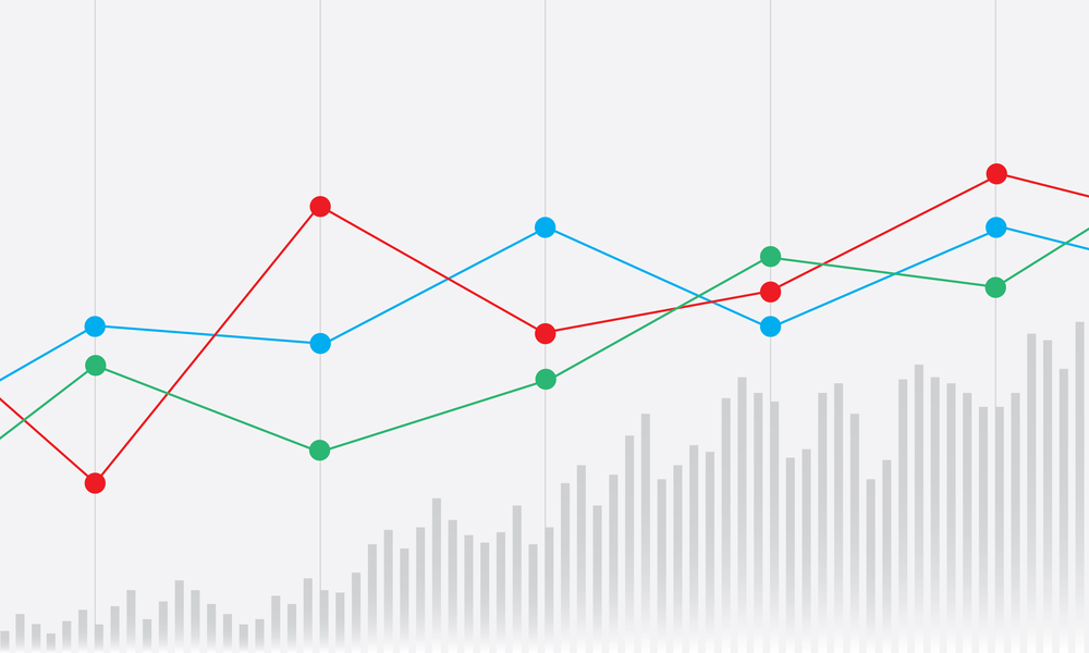
Two axes are used in the line graph: the x-axis and the y-axis.
- An x-axis is a horizontal axis.
- Y-axis refers to the vertical axis.
5. Area Chart
An area chart visualizes how a quantity or two changes from one period to another. These and line graphs are pretty similar; however, the significant difference is that the space under the line (between x-axis and line) is colored or shaded in line graphs. In both graphs, we plot the points onto the graph from the given data and join these dots with line segments, depicting the change in a quantity over time.
An area chart shows trends over time but is not so concerned with displaying exact values.
6. Bar Chart
Bar graphs (also called bar charts and bar diagrams) are visual tools that use bars to analyze data between categories. These graphs can be horizontal or vertical. We need to remember that the greater the height of the bar, the more value it has.
7. Stacked Bar Chart
Stacked bar charts, also called stacked bar graphs, serve as visual representations of how parts of a whole can be broken down. Graphs have bars that represent wholes, and each segment in the bar represents a part or category of the whole. Different colors symbolize the categories in the bars.
8. Pyramid Chart
Pyramid graphs have the shape of a pyramid or a triangle. Charts such as these are most beneficial when you have data organized hierarchically.
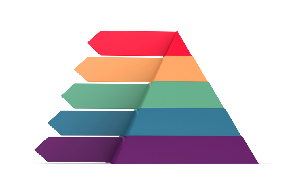
There is a progressive order indicated by the levels, like: from “most important” to the “least important”.
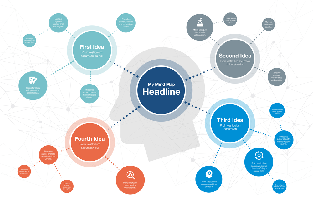
9. Mind Map
By its very nature, a mind map is a way to visualize your ideas, tasks, concepts, words, or items by grouping them around a central subject or notion. Through its non-linear graphical design, the user can construct a coherent framework that centers around the main idea. A Mind Map can make monotonous, lengthy lists of information into an easily remembered, highly organized chart that works according to the way the brain naturally functions.
Furthermore information about Mind Mapping please check out our article;
https://cinema8.com/blog/useful-mindmanager-tools
10. Decision Tree
Essentially, a decision tree has a tree-like structure with related choices and possible outcomes. Using it, individuals or organizations can weigh their possible actions based on their costs, risks, and benefits. You can use them to stimulate informal discussion or devise a mathematical algorithm to predict the best choice.
There are typically multiple branches in a decision tree, starting with a single node. There are numerous possible outcomes, and each of them produces more nodes. So it appears as a tree.

Nodes can be divided into three types:
- Chance nodes
- Decision nodes
- End nodes
The chance node indicates the likelihood of an inevitable result. The decision node shows what must be decided, and the end node indicates the decision's outcome.
11. Bubble Chart
Like scatterplots, bubble charts illustrate relationships among three or more numerical variables. Each bubble on the chart denotes a single numerical value. Each bubble's values are determined by:
1. Its horizontal location along the x-axis
2. Its vertical location along the y-axis
3. The bubble's size
Sometimes, the bubble’s color and movement can indicate more dimensions.
12. Gantt Chart
Gantt charts are primarily applied to project management and are well-known and valuable for showing activities (events or tasks) measured against time. The chart shows a list of activities to the left, with a reasonable timeline along the top. There is a bar for every activity; its length and position indicate the start date, the duration, and the completion date of the event.
By looking at the chart, you can quickly determine:
- The different types of activities
- Start and end times for each activity
- What time each activity lasts
- In what ways do activities overlap, and how much
- Dates on which the project started and ended
In summary, Gantt charts show what needs to be accomplished (the activities) and at what time (the schedule).
13. Funnel Chart
Funnel charts are special types of charts that illustrate how individuals move through business processes. The chart is named after its shape, beginning with a large head and a narrow neck. The width of the funnel represents users as it narrows, which indicates how many users are present at every stage.
14. Radar Chart
In a radar chart, multiple axes of quantitative information are displayed in a circular display, like the spokes of a wheel, creating a unique visualization of quantitative data. There are different categorical values associated with each axis. Radar charts are commonly used in sports analysis, such as in football, as a means of displaying information about a player's abilities or performance. Various axes may display pass
How to Read Radar Chart
An arbitrary shape can be created by connecting each axis up and plotting a value along each one. To begin, Identify the categories of each axis. After reading the categories around the wheel, you should then assess how they relate to one another. Typically, the center of each wheel represents the zero point of each axis. As a point approaches the spoke's edge, its quantity increases. Now consider the shape as a whole: where are the most prominent features? Which categories dominate? Do any categories lack prominence?
15. Flowchart
Diagrams depicting a process, system, or algorithm are called flowcharts. Multiple industries use them to study, document, improve, plan, and often share intricate processes in simple, easy-to-understand diagrams.
Flowcharts, often written as flow charts, consist of ovals, rectangles, diamonds, and many other shapes that define the kind of step, usually connected by arrows to show the flow and sequence.
There are several varieties of flowcharts, and they are among the most widely used diagrams in the world, applied by both - technical and non-technical professionals.
16. Venn Diagram
A Venn diagram illustrates relationships by using circles to indicate related things. The things in the overlapping part of the circles have many characteristics in common, while the items in the non-overlapping parts do not. It helps to demonstrate the differences and similarities between two concepts visually.
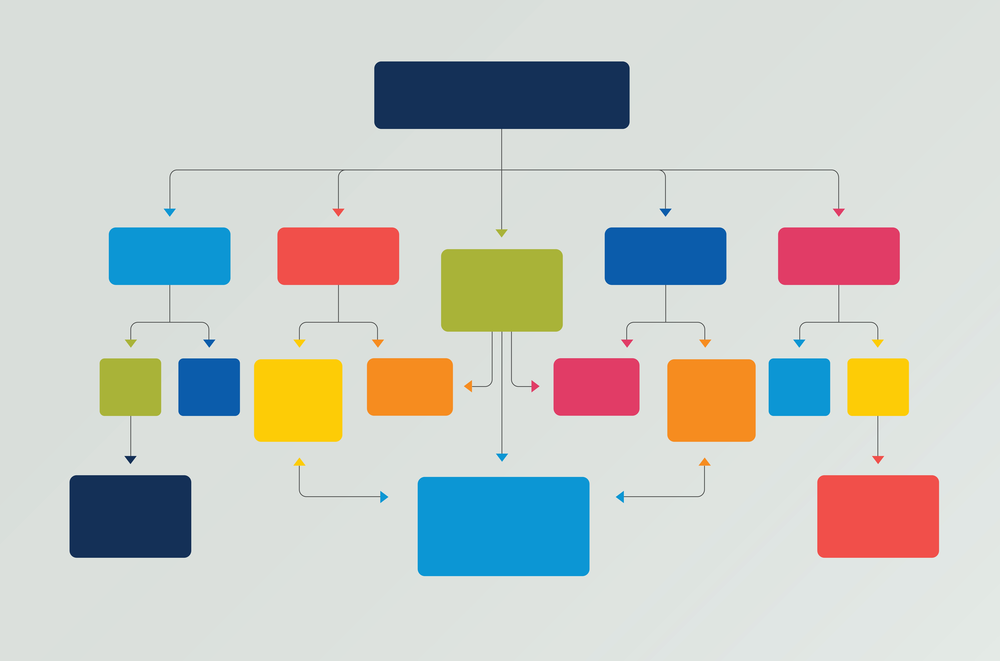
17. Concept Map
Concept maps are similar to flowcharts; however, they are more detailed. It starts from the top of the page and runs towards the bottom, having the main idea at the top and related ideas spread below in boxes or any other shape. These associated ideas have arrows or lines to show their relationships with one another.
The primary goal of a concept map is to organize and present complex ideas in a concise and straightforward manner. Education, science, business, and engineering are some fields where this powerful technique is most commonly used.
As a method to identify knowledge and understand a particular discipline, concept mapping has proven incredibly useful throughout the years. Furthermore, it enhances an author's ability to present their ideas clearly and logically, gives people a chance to assess their knowledge, and, subsequently, gives learners a better understanding of the subject.
You can find more information at our article Concept Mapping Theory;
18. Scatter Plots
Scatter plots are also known as scatter graphs or scatter charts and consist of dots to show the values of two numerical variables. On both the axes - horizontal and vertical, the position of each dot indicates the value of its respective data point. Scattered graphs are used as a means of examining relationships among variables.
19. Periodic Table
It is an array of all the chemical elements in order of atomic number, ranging from hydrogen, having the lowest atomic number, to oganesson, which has the highest atomic number. Atomic numbers are defined by how many protons are contained in each nucleus of that element's atom.
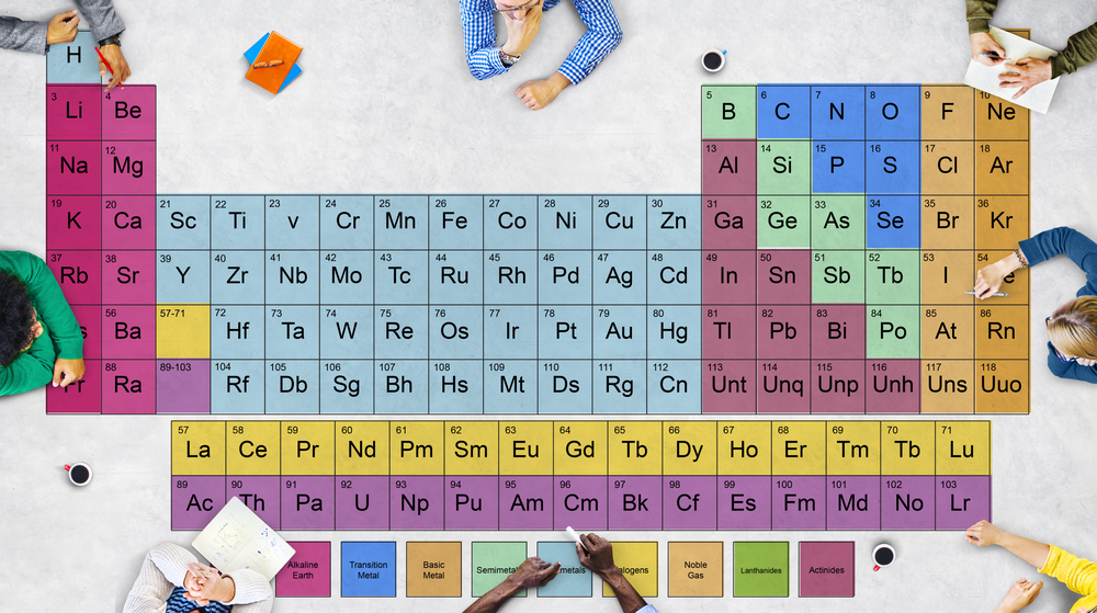
Scientists can quickly find information about elements with the periodic table, such as their chemical symbol and atomic mass. Furthermore, scientists can detect trends in element properties by studying the arrangement of the periodic table, which includes ionization energy, electronegativity, and atomic radius.
20. Iconography
Iconography refers to using symbols, figures, or virtual images to illustrate complex ideas, themes, or subjects with varying cultural significance. To understand a work of art, we must understand the iconography and symbols used in the work.
21. Speedometer Chart
Speedometer Charts, also known as gauge charts or dial charts, have needles to indicate information as readings on the dial.
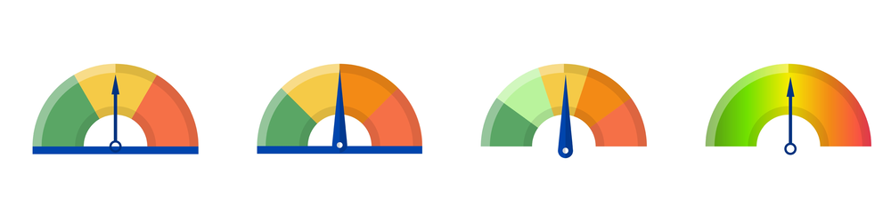
On the speedometer chart, needle values are read in relation to colored data ranges or chart axes. In executive dashboard reports, charts of this type are often used to show important business indicators.
22. Infographic
The use of infographics is to visually represent facts, knowledge, or data in order to convey information rapidly and clearly. Using graphics improves cognition by improving the ability of the human eye to recognize patterns and trends.
23. Arc Diagram
Arc diagrams are specialized types of network graphs. The graph is composed of nodes representing entities and links that represent relationships among those entities. Each node is placed along the single axis when making arc diagrams, whereas arcs denote the links.
24. Network Diagram
Project networks are graphical representations of the events and activities of a project. Throughout the project, they demonstrate the relationship between the activities, the order in which they should be performed, and why some tasks should be performed prior to the others. Additionally, networks make it possible to assess the impact of starting or ending early or late, inform about resource allocation, and enable managers to conduct "what-if" analysis.
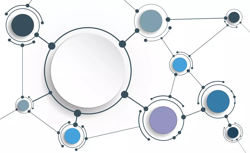
Managers can use the information to see how a plan progresses, evaluate progress, and determine the best course of action.
25. Sankey Diagram
Sankey Diagrams are a technique for visualizing flows. Various entities are illustrated by text or rectangles. They are represented by arrows or arcs whose width corresponds to the significance of the link.
Conclusion
Setting up your team for success starts with brainstorming and organization at the outset of any project. A visual representation of your thoughts is a great way to convey them to other people. Those as mentioned above are the most commonly used techniques professionals use to visualize their ideas. You can use any of these as per your content requirements so your colleagues, employees, or learners can better understand your concepts.