
Color Theory - How to Use Colors in Design
Colors have the power to stir emotions and convey meaning. They are therefore a powerful tool in e-learning course design. Selecting a color palette can be one of the most challenging aspects of creating an e-learning course. Colour palettes are limited and predefined sets of colors you use in your instructional design. A color palette must be chosen carefully to trigger the right emotion, however. If you want to make your online learners feel relaxed, you will definitely not use shockingly bright and bold colors.
In this e-learning color guide, you will learn about color Psychology, discover their hidden meaning and uses, and apply them when selecting your course colors.
What is Color Theory
The color theory describes how designers use color to communicate with users through appealing color combinations in visual layouts. Designers combine a color wheel with knowledge of human visual ability, culture, psychology, and more to choose the best colors every time.
Color Wheel by Newton
Color theory was established by Sir Isaac Newton when he devised the color wheel in 1666. In Newton's view, colors are human perceptions of wavelengths of light and not absolute qualities. He categorized colors systematically into three groups.
1. Primary Colors
Primary color is one that can't be created by combining two or more colors. It's much like prime numbers, which can't be made by multiplying two numbers together.
The three primary colors are:
- Red
- Yellow
- Blue
2. Secondary Colors
Any two primary colors listed above can be combined to form secondary colors. To create secondary colors, you must use two of the three primary colors. The general rules for creating secondary colors are:
- Yellow + Red = Orange
- Yellow + Blue = Green
- Red + Blue = Purple
Remember that using the purest form of each primary color is necessary to create the color mixtures above.
3. Tertiary Colors
Tertiary colors are achieved by combining a primary and a secondary color.
- Purple + Red = Magenta (Red-Purple)
- Purple + Blue = Violet (Blue-Purple)
- Orange + Red = Vermillion (Red-Orange)
- Yellow + Orange = Amber (Yellow-Orange)
- Blue + Green = Teal (Blue-Green)
- Green + Yellow Chartreuse (Yellow-Green)
Color Properties
In the decades that followed Newton's discoveries, the study of color expanded to include the properties of color in its two forms, namely print, screen, and in a wide range of fields, such as art and astronomy. Colors have the following four properties:
1. Hue
In essence, hue is what we are talking about when we say "color." For instance, all the primary and secondary colors are "hues". It is vital to remember hues to create a secondary color from two primary colors. You cannot generate the hue of the secondary color if you don't use the hues of the two primary colors. This is because hues have the fewest additional colors within them. The combination of two primary colors that contain other tints, tones, and shades adds more than two colors to the mixture, so the final color depends on the compatibility of more than two colors.
For instance, when red and blue hues are mixed, they result in purple, right? When you combine a red tint with a blue hue, you will get a slight tint of purple in return.
2. Shade
"Shades" are often used to describe dark and light versions of the same color. Shades are technically the colors that result from adding black to any hue. There are simply different shades depending on how much black you want to add.
3. Tint
Although tint and shade are opposites, people often fail to distinguish between the two. Adding white to a color results in a different tint. Therefore, colors can be tinted as well as shaded.
4. Tone (Saturation)
The addition of both white and black to color will create a tone. The terms saturation and tone are essentially the same, but people tend to use saturation when discussing colors for digital images and tone when talking about paintings.
What is Color Psychology
The study of color psychology explores how colors impact human emotions and behaviors. Our reactions to colors result from complex interactions between our tastes, upbringing, and cultural background.
There are subtle ways in which colors can affect perception; for example, they can enhance or diminish food taste. Similarly, colors have a significant impact on learning. It has been found that warm colors such as red, yellow, and orange increase learners' attention and stimulate active participation.
What Colors to Use in E-Learning Design
Here’s what colors you can choose to trigger a particular emotion in your learners.
Red - Passion, Excitement, and Energy
You may want to use red if you want learners' attention to be drawn to important information or if you want them to be motivated. In addition, this color is excellent for situations that demand immediate action. Red can be used, for instance, to enable learners to contemplate a topic or direct them to a particular section of the e-learning course or module right then and there.
Yellow - Intellect, Optimism, Cheerfulness
Yellow Symbolizes optimism, cheerfulness, and intellect. Furthermore, it also helps to enhance memory and improve mental function. For instance, the yellow color can help if you want to boost knowledge retention or add cheerfulness to a dull subject. Be careful, though, as bright yellow on the screen can be challenging to read.
Orange - Mental Stimulation, Optimism, and Communication
If you're addressing a dull or complicated topic, you can make the content more relatable and upbeat by using orange. To encourage learners' creativity, you may wish to consider including orange in your eLearning design’s color palette.
Purple - Fun, Imagination, and Sophistication
Choosing purple is a perfect choice if you're hoping to create an upbeat learning environment or one that encourages students to enjoy learning. When you want to set a relaxed mood, choose purples with blue undertones. However, if you wish to engage and excite learners, opt for more red undertones.
Blue - Feelings of peace, trust, and calm
Blue demonstrates feelings of peace, trust, and calm. Additionally, blue is regarded as one of the most favorable colors. Professionals in eLearning use blue to simplify a complex subject into something easy to digest since it makes the subject matter less confusing.
Green - Tranquility, Growth, and Balance
When you're trying to create a fresh and balanced design, Green color is the perfect choice. Green is also known as the color of peace, so if you're looking to calm nervous students before a big test, you might want to use it.
Brown - Feelings of Friendliness and Security
While brown color invokes feelings of security and friendliness, it also conveys a sense of seriousness. When looking for a more neutral color that can also help balance out the overall mood of the e-learning course, brown could be a good choice.
How To Use Colors in E-learning Design
Integrating colors into your e-learning design is one of the most powerful ways to boost learners' engagement and help them feel emotionally connected to your course. You can create successful eLearning courses despite having little or no experience in the industry. This is because the human brain is capable of converting colors into emotions and moods. Here are our top techniques to help answer “how to use colors in e-learning design”.
1. Understand the Mood you are Trying to Create
Make sure you know what mood or feeling you desire to evoke when using colors in e-learning. This way, you can avoid creating a mood that goes against your goals. For example, if you want to make a fun and engaging e-learning course on a dull topic, you might choose red or orange.
2. Stick to Three Colors
It is best to stick with two or three colors throughout your e-learning course, as more than that will make it look disorganized and chaotic. Having too many colors can make learners feel overwhelmed or distracted, preventing them from acquiring the information. Instructional designers often mistake featuring almost every color in the rainbow in their online course - all in the same module. As a result, the eLearning course will appear cluttered and unprofessional, confusing learners and taking away from its value.
3. Prioritize Legibility Over Aesthetics
As much as possible, always opt for warmer shades of the colors that you choose to use. This will increase your text's readability and avoid any contrast issues, especially if you're using white as your background. When choosing between using your favorite color, even if it offers insufficient contrast, and choosing one that will be more visible to the learners, always choose the latter. The objective should always be readability, not visual appeal.
4. Understand Your Audience's Background
Each culture assigns different colors with meanings. For example, some cultures consider red to be off-putting while others perceive it as energizing and lucky. Therefore, before selecting your preferred color grading, it's a good idea to know the background of your audience. Additionally, consider their religion, age, and educational experience because these factors directly impact their preferences and interpretation of colors.
Also, don't forget that some students may be colorblind. Therefore, make sure you use different font types and underline or place them in a box to make your points visible.
Keeping these e-learning tips for choosing colors in mind will help you turn even the driest and dull subject matter into a visually engaging learning experience.
How to Choose Your Color Palette
Choosing color schemes for courses is a challenge for many e-learning designers. The decision can seem daunting because there are so many possibilities. Nonetheless, it's worth knowing how to use popular color palettes and when to use them.
Bright Colors Palette
A bright color is just what it sounds like: bold and vibrant! Their colors are typically bright, ranging from sky blue to bright yellow to fire-engine red. Use these vibrant colors sparingly-a few pops of color here or there make quite an impact-to capture attention, or highlight important information. Generally, brights are suitable for a wide range of subjects but might not be your first pick for somber content.

Jewel Tones Palette
Color tones similar to those found in precious and semiprecious gems are known as jewel tones. The bright blue of sapphire, the deep red of ruby, and the green of emerald are well-known jewel colors. Bold, classic jewel tones are associated with richness and luxury. You might consider jewel tones if you want to incorporate color in your design, but you're unsure about bold colors. Since the colors are softer on the eye than brights, they can be added to your design more freely.

Earth Tones Palette
Tans, browns, grays, and greens make up most of the earth-tone palette. They're all inspired by the planet, including moss, rocks, dirt, trees, and plants. It's a great color combination if your subject is about the environment, nature, or the earth. You'll want to choose shades that contrast nicely with one another to avoid a bland appearance.

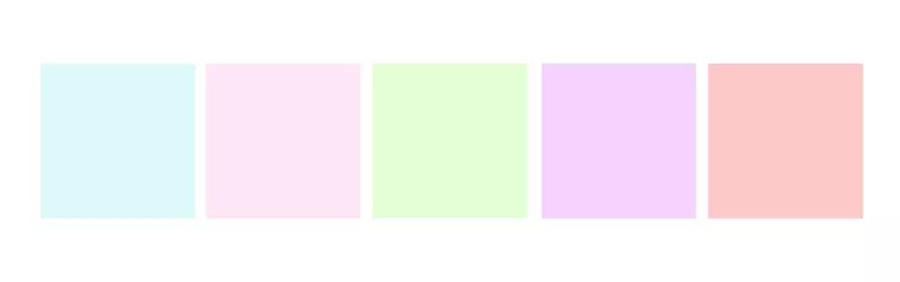
Pastel Color Palette
Pastel colors have low saturation and are light in color. Popular examples of pastel shades include light pink, mauve, and baby blue. It's best to use these color schemes when you have a topic or a subject matter that's calming or soothing. Because this color scheme is not very vibrant or bold, you may have difficulty highlighting information until you add another popping color to make them stand out a bit more.
Grayscale Color Palette
Known also as grayscale, this color combination consists of black and varying shades of gray, ranging from dark to light. Greyscale is a versatile neutral palette you can use again and again. Greyscale may be the right choice for serious or highly professional subject matter since it creates a colder, more impersonal effect.
Tip: Choosing a grayscale palette can seem boring very quickly, so add at least one jewel tone or bright color to keep the design appealing.

Conclusion
And there, favorite you master the art of choosing exciting colors for your next e-learning design! Color grading and color correction might be a difficult task, but we hope this guide has helped you a lot in figuring out your favorite palette.
If you are still confused about choosing the right color for your online course, consider using Cinema8 design templates.
Also you can check our article https://cinema8.com/blog/how-colors-affect-your-brand-marketing for more information about affect of colors.
We use highly engaging and appropriate colors that are neither distracting nor boring. Happy coloring!